Art Size 180 for Text And Lettering in Hideout Art
When 180 units is a good starting point for text and lettering inside the decoration budget.
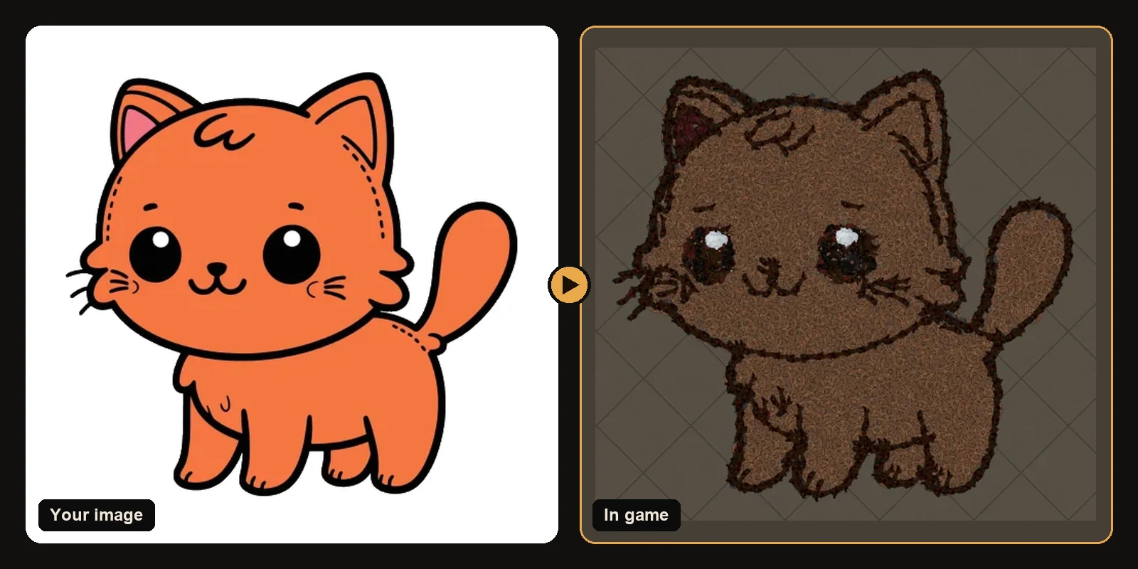
When 180 units is a good starting point for text and lettering inside the decoration budget.
The same workflow works in Path of Exile 1 and Path of Exile 2. Only the decoration list and hideout types change when you switch games on the generator.
Why art size matters
Art size is the longest side of the picture on the hideout floor measured in game units. Bigger art shows more detail and usually needs more decorations. Smaller art protects the 750 decoration budget so you can still place stash benches and a few favourite MTX pieces around the picture.
Because the art is an area, doubling the size roughly quadruples the piece count. That is why faces and fine lettering often need a careful bump in size while busy full-body scenes may need to stay moderate so the silhouette still fits.
Starting at 180 units for text and lettering
For text and lettering, 180 units is a sensible first preview. It is not a magic number. It is a middle ground you can nudge after you see the free preview:
- Generate once at 180.
- If eyes text or logo corners look soft, raise size by 20 to 40 units and preview again.
- If the decoration count presses the limit, lower size or reduce max colours instead of ignoring the cap.
- Keep one subject in frame so budget is not wasted on background noise.
How size interacts with the 750 cap
Path of Exile allows 750 decorations in a hideout. Functional objects like stash waypoint crafting bench and masters do not count toward it. The generator fits every download inside that limit. If your chosen size would need more pieces, outlines switch to more efficient strokes first and the art may scale down just enough to import completely.
So a larger requested size is a request for detail, not a promise that every pixel becomes a decoration. Judge the result from the preview and the decoration count on the result page.
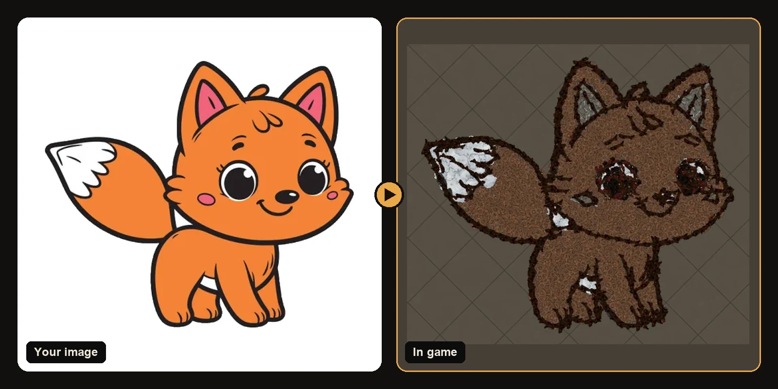
Tuning tips by subject
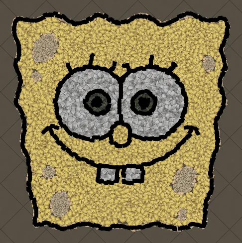
- Logos and text: thick letters at a moderate size beat thin fonts blown up huge.
- Faces and portraits: give eyes and mouths room. Soft mouths usually mean the size is too small.
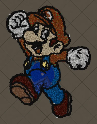
- Full characters: crop legs or background if the count climbs too fast.
- Emojis and icons: they stay clear at smaller sizes because the shapes are simple.
- Line art: size helps the brush trace stay continuous along curves.
Workflow that wastes fewer conversions
Plans include unlimited previews. Use that:
- Upload a cleaned image.
- Preview at 180.
- Change only one setting at a time (size or max colours or outline).
- Download only when the silhouette still reads as the subject.
Next steps
- How to make hideout art: the full step-by-step walkthrough.
- Best images for PoE hideout art: what converts best and how to prepare it.
- How to import hideout art: getting the file into your hideout.
- How PoE hideout art works: what the generator does under the hood.
- How many decorations does hideout art use?: art size, the 750 cap and typical counts.
- Open the generator and try a free preview.
Art guides
View all
Cartoons
How to Make Tom the Cat Hideout Art in Path of Exile
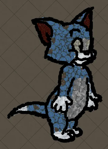
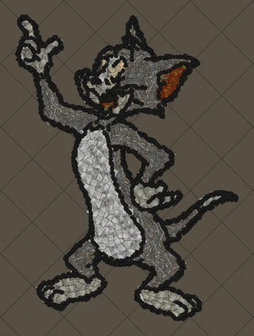
Tom from Tom and Jerry is all expressive curves: pointed ears, a long tail and a two-tone blue-grey body. The outline engine follows every one of those curves, which makes Tom a great showcase of how decorations bend along a drawing.
 Cartoons
How to Make Tom Waving Hideout Art in Path of Exile
Tom in a full-body waving pose. Long limbs and a long tail make this a great example of decorations being rotated to follow the direction of each line.
Pokémon
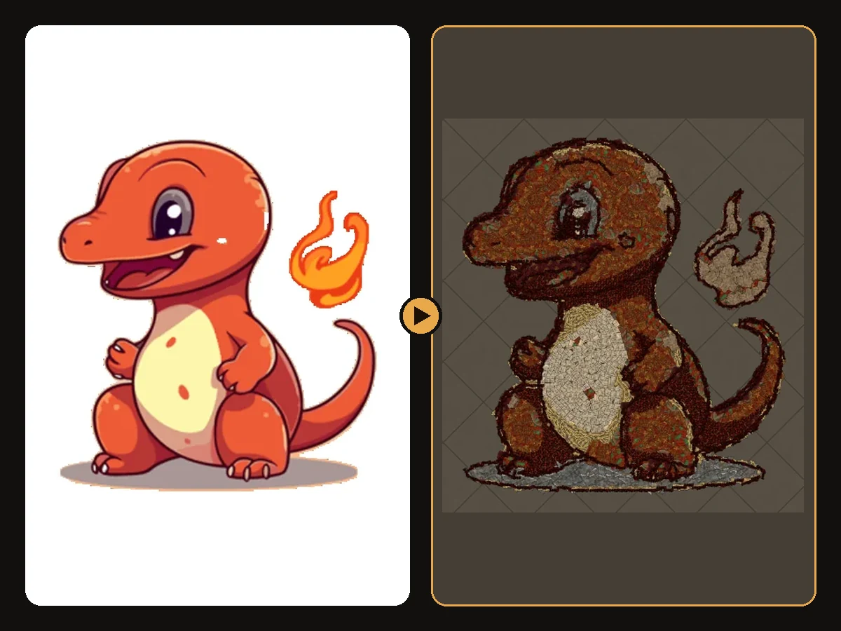
How to Make Charmander Hideout Art in Path of Exile
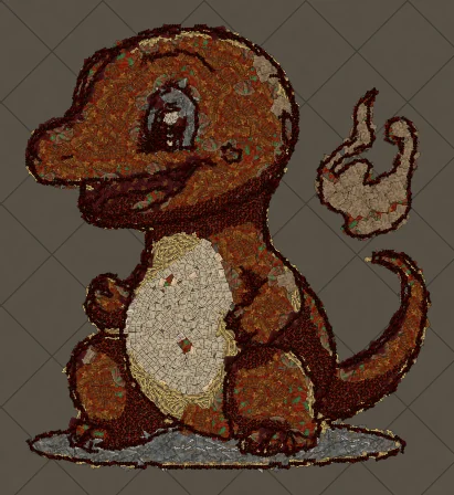
Charmander, the Fire-type starter Pokémon, is one of the most loved designs in the series. Its warm orange body, cream belly and flame-tipped tail map beautifully onto the earthy reds and browns that Path of Exile decorations do best.
Keep reading
 Guides
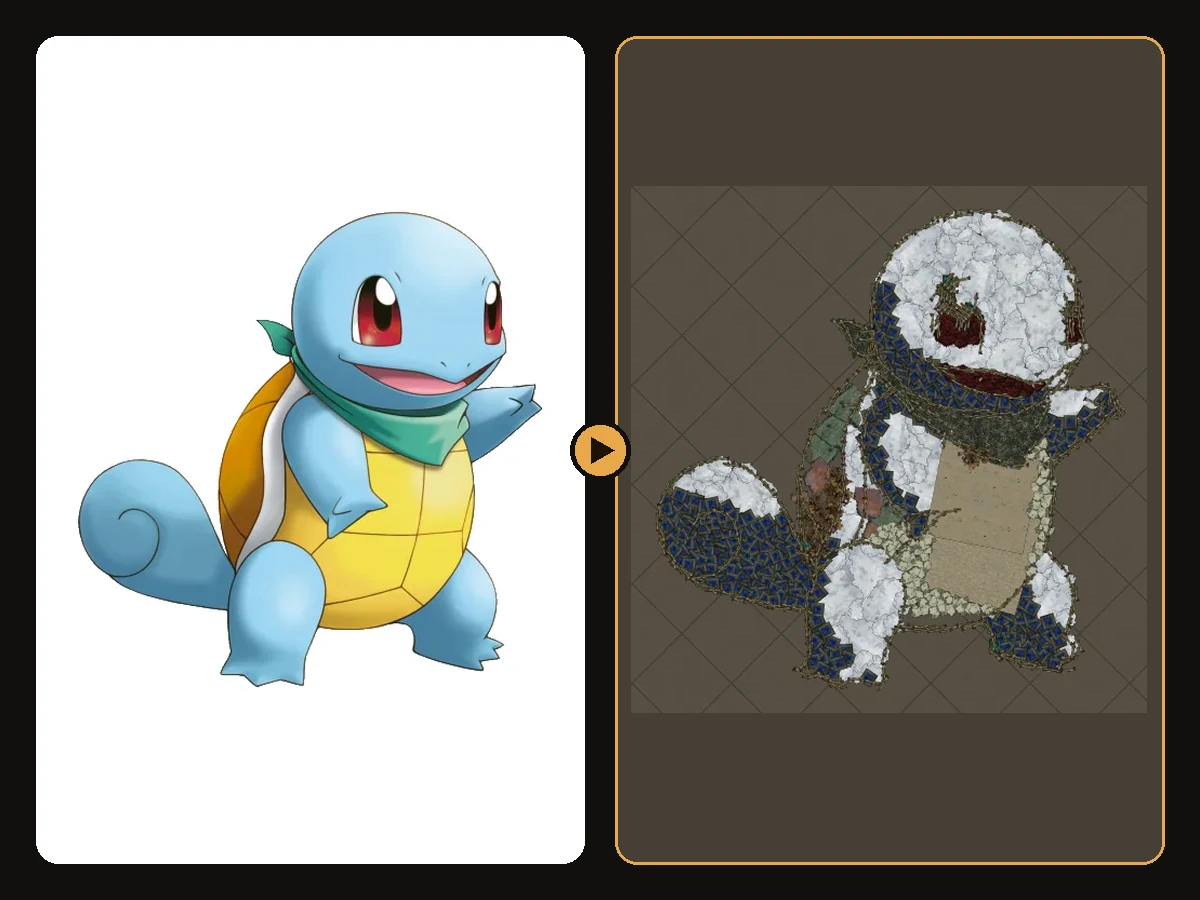
How to Make Sharp Looking Hideout Art
Practical steps so generated Path of Exile hideout art stays readable from the camera.
 Tips
How to Keep a Clean Silhouette in Hideout Art
Cropping and background choices that stop the generator from building clutter.
 Guides
How to Turn a Logo into Hideout Art
Flat colours and bold shapes make logos some of the cleanest hideout art.